Yamaha Outboards
Creating a new, mobile-friendly site with an emphasis on the boating lifestyle.
The Low Down
My Role:
User Experience Designer & Producer
I worked with a digital team of about twelve to build a website that showcased Yamaha’s high quality media and provided resources to outboard owners.
What I Did:
- Information Architecture
- Wireframe & Prototype Development
- Project Management
Time:
2 years
Stuff I Learned About Boats:
I sort of know what an outboard is now.
The Situation
Yamaha Outboards’ old website was very popular; it received an incredible amount of visitors and that number was only increasing every month. But it had a problem: it’s "mobile" site was maintained separately from its “desktop” site. This caused additional work every time we made an update, and also led to a fractured user experience that changed depending on how users were accessing the website. If a user copied a URL on their desktop and later tried to visit it on their phone...well, that didn’t always work.
Everyone knew this experience wasn’t ideal and the site was beginning to get penalized in Google search rankings. Yamaha decided to rebuild their website from the ground-up, not only changing their backend platform (from Drupal to Kentico), but revisiting how to feature their exciting visual content.
Analysis
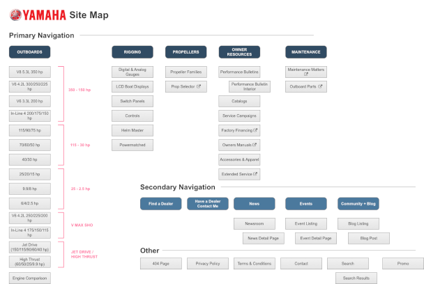
As with any website rebuild, we did a thorough analysis on their existing website. That meant mapping current state and digging into Google Analytics. We worked diligently to determine what was and wasn’t working and then met and interviewed the Yamaha team to get further insights.
We found that, overall, the structure of the site worked well: people were readily finding and engaging with content. There were a few dead-ends, however, and some useful content buried layers deep in the site’s hierarchy. We recommended elevating those areas and building out more full-featured sections for accessories and propellers. We also wanted to make the process of narrowing outboard selection easier; there are a lot of options and we learned that some users had difficulty with it on the old site.
New Design
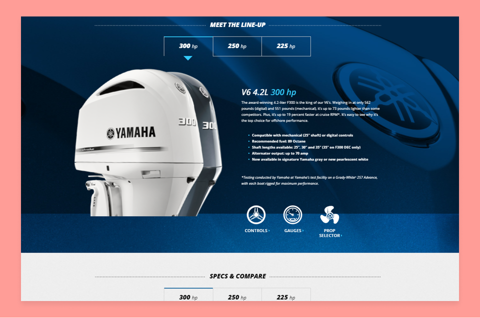
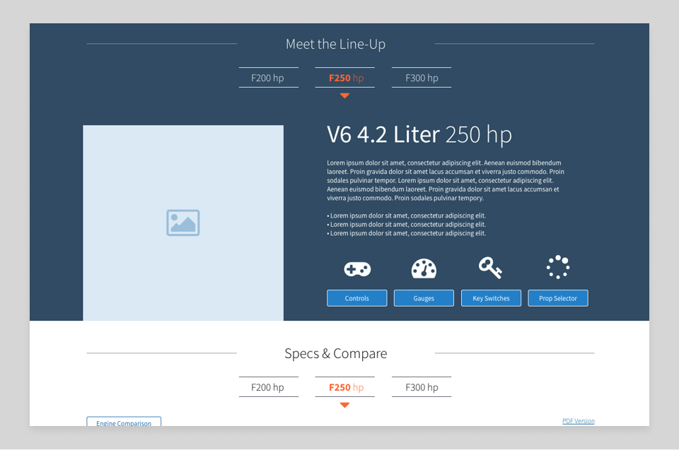
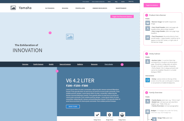
One of the charges for the project was to take advantage of Yamaha’s rich library of stunning photography and videos. After identifying page templates, I worked on wireframes that emphasized imagery in hero banners and CTAs. I worked on gallery widgets and media browsers that could slot in as components on product and accessory pages.
The two incredibly talented visual designers on our team expanded on these ideas and proposed more interactive widgets, such as a slide-to-reveal look at the inside of an outboard. I worked together with them and our developers to iteratively build and test interesting and engaging ways for users to learn about outboards. We ended up with pages that not only looked good, but were much more informative and engaging than competitor sites.
Outboard Resources
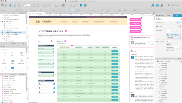
One important persona included in our analysis was the existing outboard owner. They used the website very differently than prospective customers: less likely to engage with media and lifestyle content and more likely to search for documentation, instructional videos, and performance bulletins.
We wanted to emphasize the accessibility of this content by making it easier for owners to quickly filter, sort, and identify what they were looking for. It wasn’t an unreasonable scenario for a boat owner to be looking for a manual before launching off the dock - or even when in the water. That meant that it needed to be quick.
Working with the Yamaha product team, we added a large set of intuitive selection filters for this content. I built interactive prototypes for desktop and mobile that allowed Yamaha and others to test-drive them with real data. To cap it off, we even made the performance bulletins more dynamic: what was previously a static PDF was now a page that allowed users to use interactive charts.
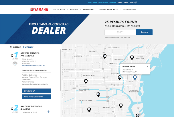
The Dealer Locator
Yamaha Outboards didn’t sell outboards directly; instead, their key site conversion was to send people to their local outboard dealer. One of the strongest indicators of website success was how often it was used to view dealer information.
We wanted a best-in-class experience, and that began with looking at competitors. The entire team worked together to figure out what sites had great, effective retail locator solutions and why. We met with the Yamaha product team and used user behavior data to determine the requirements for our new Dealer Locator.
I worked closely with our front-end development lead to build low-fidelity, mobile-first prototypes. Once we settled on a direction, we tested the prototype, made revisions, and increased the fidelity and interactivity until we eventually had a well-tested, well-vetted conversion machine. The end result allowed users to easily select what they were looking for and find the closest matching dealer with both a list and interactive map. Best of all? It was a great experience on mobile devices.
