Wahl
Consolidating three websites into one and adding eCommerce.
The Low Down
My Role:
Sr. User Experience Designer
I worked with a digital team of about ten to build an easy-to-use site that provided users an easy way to learn about and purchase Wahl consumer products.
What I Did:
- Information Architecture
- User Interviews & Analysis
- Wireframe and Prototype Development
Time:
1.5 years
Thing I Didn’t Know When I Started:
Effective eCommerce design is very, very difficult.
Time for a Change
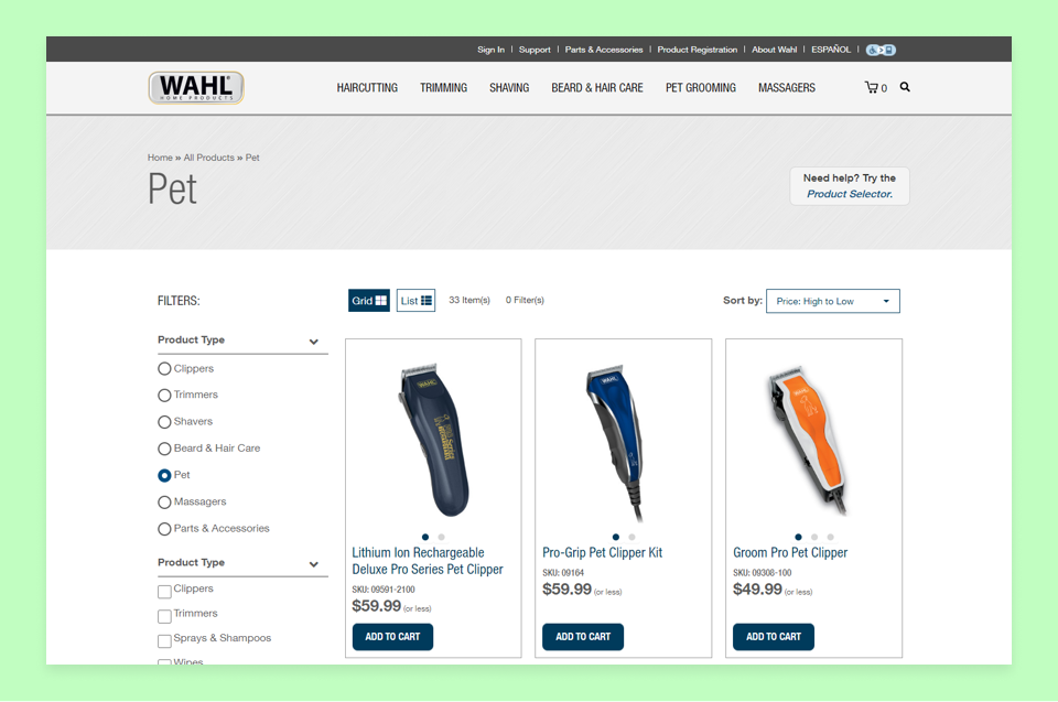
Wahl had a problem: they had three consumer websites for their three consumer product lines (personal grooming, pet grooming, and massagers). This was a tax on their resources and fragmented their own branding. At times, they were competing in organic search with themselves! Understandably, they wanted to merge their sites under one, unified platform. There was one wrinkle: users needed to be able to purchase products directly from their site, something Wahl's consumer line hadn’t done before.
Information Is Key
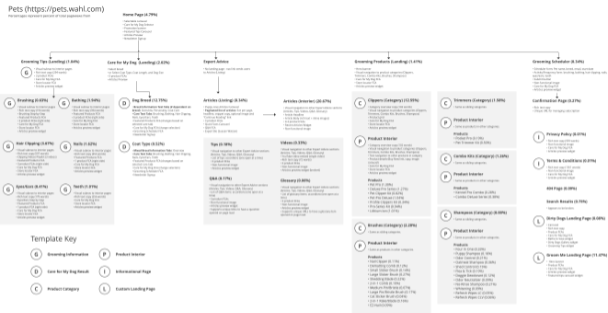
Understanding their existing information architecture was the first step in planning a new site. I used an obscure tool called PowerMapper to crawl through their existing sites and build a current state site map. I then used their Google Analytics data to better understand how users interacted with those sites and SEMRush to determine their most effective organic search terms.
Using this data, I sought to answer:
- How often is each page visited?
- How long do users spend on each page?
- How do users arrive on each page?
- What navigation paths are most common throughout the sites?
- If arriving from organic search, what terms are users searching by?
When complete, we had a strong idea about what users were looking at and how they got to that information. But we still didn’t know how they interacted with each page. So, we added HotJar heatmap tracking to several heavily trafficked pages to learn where specifically users were clicking and scrolling.
We rounded off our understanding by interviewing Wahl product owners to better hear how their product lines and processes worked. Were there data limitations or other considerations for why their content was organized the way it was? What research already went into their decisions?
After several months, we had data-backed information about how their content was organized, and what was effective and why. We learned, for example, that much of their “lifestyle” content for pet grooming performed extraordinarily well, especially via organic search. We also learned which types of interactive content saw engagement, and how some navigation paths lead to conversion deadends.
The New Site
Our next step was to assemble this data into recommendations for a new, unified experience. We faced challenges that didn’t exist before, like how to better differentiate personal grooming from pet grooming, and how to add several new product lines to the site. We worked on multiple iterations of a proposed new site map, meeting with the Wahl team and revising until we got to something that both sides were comfortable with. We then tested it with users.
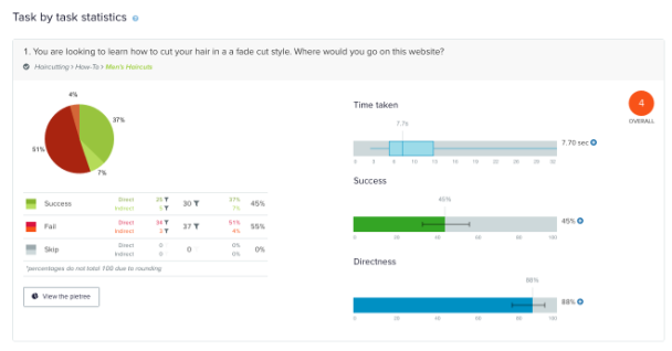
I used OptimalWorkshop’s TreeJack testing to learn how quickly and effectively users could find certain pages when presented with our new navigation. We recruited 70 people in our target demographic and gave them three tests. We identified some clear problems, so we met with Wahl, iterated, and tested the final product again. Our second attempt proved more successful; we saw very few failures and less time taken per task.
Eventually, I compiled this information into a recommendations report and presentation. We used all of the data collected to make actionable proposals for new site’s features, content, and organization. After some revisions, we had our marching orders that would inform the new site’s design and structure.
Wireframe & Prototype Development
Wahl wanted to understand how the site would work as we worked on it. So, I opted for building low-fidelity, interactive prototypes in Axure as our working wireframes. This allowed both us and Wahl to understand how navigation and layout worked across the product lines.
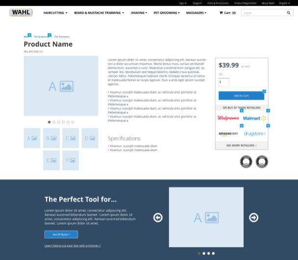
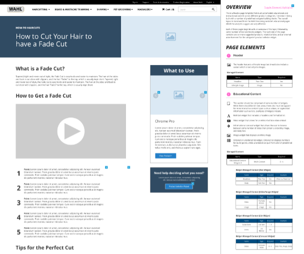
We identified the different types of page templates based off of the recommended site map, including category landing pages, lifestyle content pages, and product pages. The prototypes used realistic placeholder content (such as copy from their existing sites) and navigation and CTA links all pointed interactive page templates. This was a useful tool for us to simulate real navigation paths and more effectively test our interaction patterns.
Reusable Components
This project was underway just before reusable design systems became an industry trend, but nevertheless, we felt the pain of not having standardization. Wahl’s prior sites were besieged by ad-hoc components and drifting standards. It affected our users as well as development: we were constantly building one-off CMS components that would rarely see widespread use. We were not only wasting time and energy, but adding unpredictability to the user experience.
This time, we built a flexible set of components that could be easily placed and configured by any site administrator. We looked to existing and new content to determine how to make our components long-lasting. This meant working together with copywriting, development, account management, and visual design.
Eventually, we landed on a list of components that would allow us to easily compose the site and also be adaptable enough to create new pages and templates in the future. These components were documented both as annotated Axure interactive wireframes and in a resource document. The latter contained unique IDs and all component properties were explained in plain language. The page templates were then built so that components could easily be added, changed, and re-ordered by any content administrator.
eCommerce
Wahl wanted users to buy products directly on their website, as well as locate nearby physical retailers. We learned early from interviews and data analysis that users often had difficulty narrowing and filtering their selections to determine which was most appropriate product for their needs. As such, we wanted to make an effective product listing experience.
We started by analyzing competitor websites and eCommerce implementations in adjacent industries. We took screenshots and noted what we liked and what we found confusing. We shared our findings with Wahl and asked them to do the same. Eventually, we had a list of rough requirements and priority order, but we needed data to validate our initial assumptions.
We purchased a report from Baymard on product listing pages and boy, do I recommend doing that. It was an outstanding qualitative and quantitative research document built from user testing hundreds of popular online commerce sites. It was an invaluable resource, not only providing recommendations on what to do but why, with direct feedback from users and quant data on how quickly and effectively users were able to complete shopping tasks in different situations.
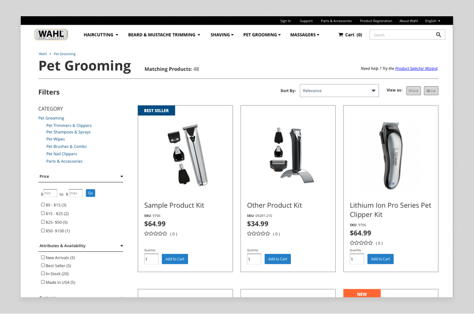
This research allowed us to better refine our backlog and shape our decisions for the listing page. I worked on numerous interactive Axure prototypes, iterating and testing over several designs. I took advantage of Axure’s capabilities by populating real data for a single Wahl product category and allowing people to test filtering, sorting, and viewing results. The good news? Not only was Wahl happy, but the page directly led to increased conversions and a quick, easy-to-understand buying experience.
