UnitedHealthcare
Replacing a critical 30-year old mainframe application.
The Low Down
My Role:
User Experience Lead
I managed a team that ranged from 3 to 6 people throughout the project.
What I Did:
- Information Architecture
- Usability Testing
- User Interviews & Analysis
- Wireframe & Prototype Development
- Visual Design
- Design System
- ...you name it on this one.
Time:
3+ years
Cold Brew Coffee Consumed:
6,000 ounces given 8 ounces per day with 250 business days per year over 3 years.
Into the Future(ish)
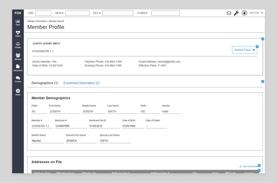
It's no surprise to hear how valuable COBOL programmers are nowadays: a lot of critical infrastrure still depends on applications built decades ago. These green screens running in terminal emulators are complex, sprawling, and challenging to update.
Our project? Replace one of these applications with a modern, single-page web application. For the sake of this story, the actual purpose of the application has been omitted, but just assume it does something important and excessively complicated.
Understanding
One early learning: an appication as old as The Empire Strikes Back has a lot of nuance.
We interviewed dozens of users, asking them how they used the mainframe screens, their biggest pain points, and how they adapted their business processes to the limitations of the application. We also found great value in asking users to self-record their daily tasks, allowing us to review videos at our own pace and create follow-up questions for users.
Analysis artifacts included: screen catalogs, task maps, information architecture diagrams, user personas, and more.

Design Strategy
Our approach was driven by the unique needs of our users’ jobs. Many roles performed repetitive, time-sensitive tasks, so we emphasized speed and clarity in information presentation and interactions. Users emphatically believed that the application should stay out of their way as much as possible.
Layout
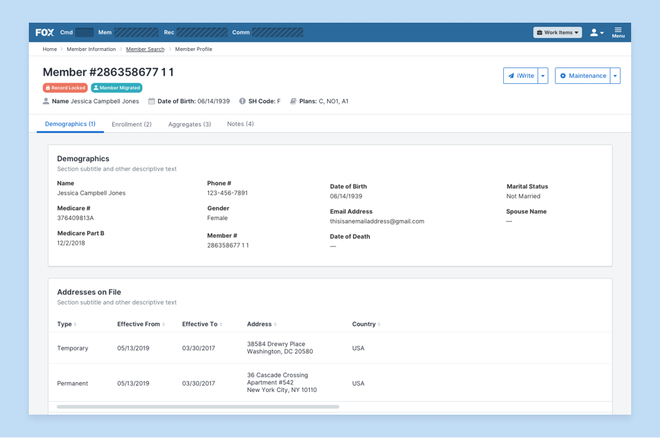
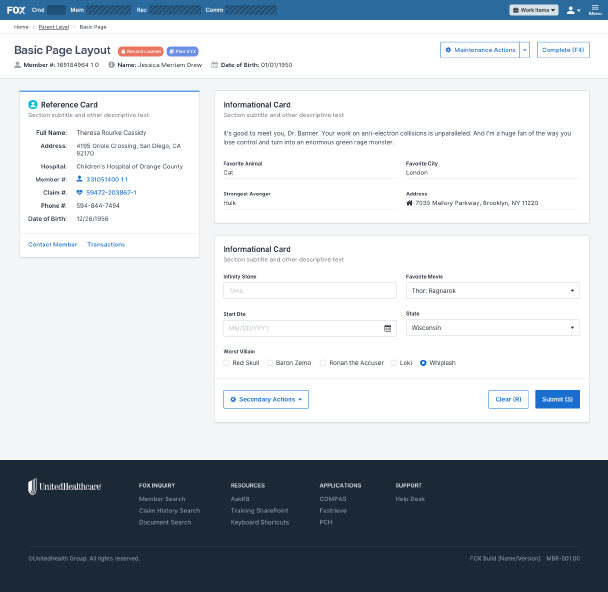
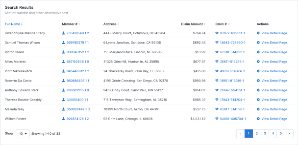
One of the chief complaints with the original application was that information was scattered throughout different screens due to space limitations. Our new application was unburdened by these constraints, so we consolidated where possible. This, however, meant more data-per-page, so we adopted a card-based layout to make pages more scannable. It also allowed us to create keyboard shortcuts to skip to the next or previous cards, allowing users to quickly navigate a page with only the keyboard.
Data
The legacy application offered few instructions. At times, it was vague in what it expected: some fields would imply that a “Y” or “N” were valid choices, but also accepted unlisted, alternate values. In one unnerving case, a field was hidden from users unless the value “999999” was entered in a separate field. This wasn’t explicitly documented; it existed only as domain knowledge held by longtime users.
This obfuscated knowledge was a tax on the organization: it became more time-consuming to train new users and resulted in veteran users being the only reliable source of truth for business processes.
We emphaized clear instructions in the new application, adding section titles plain text where possible. We eliminated esoteric abbreviations and added scoped choices (checkboxes, selects, etc.) instead of free-form responses on all fields. Tooltips also provided clarity for users without taking up valuable screen real estate and slowing power users.
Borrowing the Good
Interviews and observation showed that some aspects of the legacy application worked well. Having an easily accessible command bar allowed users to navigate efficiently, especially when using parameters to bypass top-level pages. It also made heavy use of shortcuts and key combinations to move throughout screens and rapidly manipulate data. We incorporated these popular features into the new application where possible, not only to provide a smooth transition for users, but to make data entry as easy as possible.
Testing
Our testing strategy was a two-pronged approach:
- Test and validate in-flight features
- Get feedback on global design strategies
Feature Testing
When working on features involving the user experience, we tried to get in front of our end users as much as possible given the time permitted. In the best case scenario, that involved interactive prototypes and time for revisions. We matched prototype fidelity to the need; sometimes testing low fidelity concepts to validate general direction, while other times trying to emulate the actual application as closely as possible to learn about specific usability impacts.
General Usability Tests
In addition to feature-level testing, we held regular usability tests to dive into open questions we had as a design team. For example, our team ran tests on how users interacted with error messaging and how effective they were with finding data in different table orientations. While these tests didn’t always relate to a specific story or feature, the findings contributed to our approach and informed our design patterns.
Testing Tools
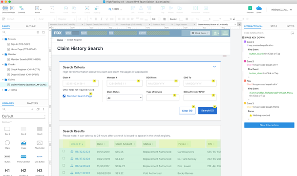
Discussing favorite prototyping tools ventures into Internet holy war territory, but I’m a firm believer in using whatever is right for the job. On this project, I often prefered Axure when any complex interactions needed testing. It has a steep learning curve, but is the closest you can get to simulating a real application without coding. Well...you can, in fact, inject JavaScript into its prototypes to even further tweak it. For tests where we were more concerned with flow over UI interactions, we stuck with Invision prototypes made from our Sketch page layouts.
Design System
As the project grew in speed and size, we quickly realized that not having centralized design standards negatively impacted our team, but also our developers and product owners. We found multiple versions of the same UI components throughout the application, each with slightly different variations. In some cases, the differences were small: padding or font size. In others, the entire implementation was different. This was a problem not only for end user consistency, but for long-term maintenance of the application.
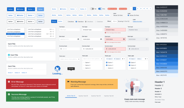
We spent the better part of a year taking what we had already built, filling in the gaps, and authoring standards. What we ended up with was a design system called… ahem...THANOS.
The system included the documentation of the UI components and patterns (including implementation API), but also the approach for how we solved problems. We wanted our design solutions to be consistent whenever possible. The team wrote about topics such as how we approached error messaging, voice and tone, and conditionally displayed content.
We knew it was successful when the system documentation site went from something only our team used, to one where we began receiving questions from developers, product owners, and testers.
The design system was a project unto itself, and one that I could write about for a few more thousand words. Until that time comes, I’ll describe it as: fun, painful, and necessary.
